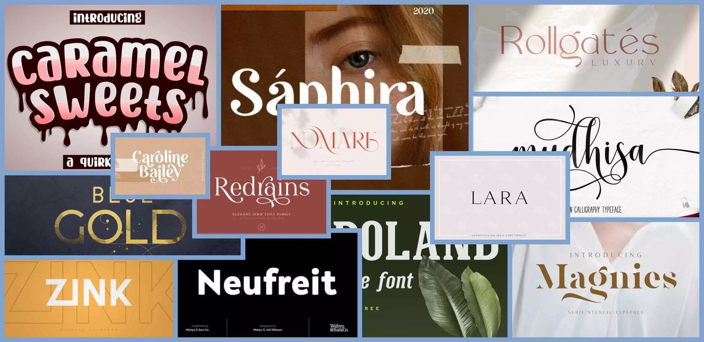
Unlocking Awesome Presentations: The Ultimate Guide to Presentation Fonts
Have you ever sat through a presentation where the slides were visually jarring, the text difficult to decipher, and the overall effect, well, underwhelming? The culprit might have been a poor font choice. Choosing the right presentation font is a crucial step in effectively communicating your message. A well-chosen typeface can enhance readability, create a professional look, and even influence how your audience perceives your information. In this guide, we'll delve into the world of presentation typography, exploring everything from classic choices to modern trends, and providing you with the knowledge to make informed decisions for your next presentation.
So, what constitutes an ideal presentation font? It's more than just picking something that looks "nice." The best fonts for presentations prioritize clarity and readability, ensuring your audience can easily absorb the information being presented. Factors like font size, spacing, and even color play a role in how effectively your message is conveyed.
Historically, fonts like Times New Roman and Arial dominated the presentation landscape. While they offer familiarity, these fonts can sometimes appear dated or lack visual appeal in the context of modern presentations. The evolution of digital typography has introduced a wealth of new font families, each with its own unique personality and potential impact on your presentation's effectiveness.
Choosing an inappropriate font can lead to a number of issues. A font that's too small or stylized can strain the eyes of audience members, hindering their ability to follow along. Conversely, a font that's too large or bold can appear overwhelming and detract from the content itself. Striking the right balance is essential for creating a visually appealing and engaging presentation.
The ideal presentation font is, therefore, a balancing act between readability, style, and impact. It should complement your content without overpowering it, creating a seamless visual experience for your audience. Let's delve deeper into understanding which font families excel in this regard.
Fonts like Helvetica, Open Sans, and Roboto are renowned for their clean lines and excellent readability. They're considered safe choices for almost any presentation scenario. For a more modern feel, fonts like Montserrat and Lato offer a sleek and contemporary aesthetic. Serif fonts, such as Playfair Display or Georgia, can add a touch of elegance to more formal presentations.
One benefit of using a clear and legible font is increased audience engagement. When your audience can easily read your slides, they can focus on the content and message, leading to better comprehension and retention. Choosing appropriate fonts also projects professionalism, enhancing your credibility and the perceived value of your presentation. Finally, well-chosen typography can create a visually appealing presentation that captures attention and leaves a lasting impression.
Advantages and Disadvantages of Different Font Types
| Font Type | Advantages | Disadvantages |
|---|---|---|
| Serif (e.g., Times New Roman, Georgia) | Traditional, formal, readable in print | Can appear dated, less readable on screens at small sizes |
| Sans Serif (e.g., Arial, Helvetica, Calibri) | Clean, modern, highly readable on screens | Can appear impersonal, less distinctive |
| Decorative (e.g., Pacifico, Lobster) | Eye-catching, adds personality | Difficult to read, best used sparingly for headings |
Best Practices:
1. Limit your font choices: Stick to two or three fonts maximum.
2. Use large font sizes: Ensure readability from a distance.
3. Optimize for different devices: Test your presentation on various screens.
4. Consider color contrast: Ensure sufficient contrast between text and background.
5. Maintain consistency: Use the same fonts and sizes throughout your presentation.
Real Examples:
1. Apple Keynotes: Often uses San Francisco for a clean, modern look.
2. Google Slides: Frequently utilizes Open Sans for its excellent readability.
3. Corporate Presentations: Helvetica is a popular choice for its professional appearance.
4. Design-focused Presentations: Montserrat and Lato are favored for their contemporary aesthetic.
5. Academic Presentations: Times New Roman or Georgia are sometimes used for a more formal tone.
FAQ:
1. What is the best font size for presentations? At least 24 points.
2. Should I use serif or sans serif fonts? Sans serif is generally preferred for screen readability.
3. How many fonts should I use in a presentation? Stick to two or three.
4. What are some good free fonts for presentations? Open Sans, Roboto, Lato.
5. How can I ensure my fonts are readable? Use high contrast and large sizes.
6. Can I use decorative fonts in presentations? Sparingly, for headings or short phrases.
7. How do I choose a font that reflects my brand? Consider your brand personality and target audience.
8. Are there tools to help me choose presentation fonts? Yes, online resources and font pairing websites can be helpful.
Tips and Tricks:
Use font pairing tools to find complementary fonts. Test your presentation on different projectors and screens to ensure optimal readability. Consider your audience and the overall tone of your presentation when making font choices.
Choosing the right presentation font is a critical aspect of creating effective and engaging presentations. By prioritizing readability, consistency, and visual appeal, you can ensure that your message is delivered clearly and resonates with your audience. From selecting appropriate font families to optimizing for different devices and considering color contrast, careful attention to typography can elevate your presentations from ordinary to extraordinary. Remember, the right font is more than just aesthetics; it’s about communication, impact, and leaving a lasting impression. Take the time to experiment with different fonts and find the perfect typefaces that will enhance your next presentation and help you achieve your communication goals. Don't settle for a presentation that's merely seen; strive for one that's truly understood and remembered.
Roxana my new love exploring the phrase and its significance
Unlocking canine contentment exploring kong dog toys on amazon
Cracking the code cara menghitung biaya pembangunan rumah


