Unlock CapCut's Potential: Finding the Perfect Fonts
Want to transform your CapCut videos from amateur to amazing? One of the most impactful yet often overlooked elements is font choice. Selecting the right typography can drastically elevate your video's aesthetic, enhance readability, and convey the perfect mood. This comprehensive guide delves into the world of CapCut fonts, equipping you with the knowledge and resources to make your videos truly shine.
CapCut, a powerful yet user-friendly video editing app, offers a wide array of built-in fonts. However, truly maximizing its potential lies in understanding which fonts work best for different scenarios. Whether you're crafting a dynamic promo, a heartwarming family montage, or a sleek corporate presentation, the right font can make all the difference.
Think about it: a playful, handwritten font might be perfect for a lighthearted travel vlog, but it would feel out of place in a serious documentary. Conversely, a bold, sans-serif font could be ideal for a fitness motivation video, but too harsh for a wedding highlight reel. This guide will help you navigate these nuances and choose fonts that perfectly complement your video's content and target audience.
The importance of suitable typography in video editing cannot be overstated. It contributes significantly to the overall visual appeal, ensuring that your message is communicated effectively and resonates with viewers. Poor font choices can distract, confuse, or even detract from the video's quality, whereas well-chosen fonts enhance professionalism and create a cohesive, engaging viewing experience.
Navigating the world of CapCut fonts can be daunting, especially with the constant influx of new trends and styles. Common issues include finding fonts that are both visually appealing and legible on different screen sizes, understanding how to install custom fonts, and selecting fonts that align with the overall tone and message of the video. This guide will address these challenges and empower you to make informed decisions about your CapCut typography.
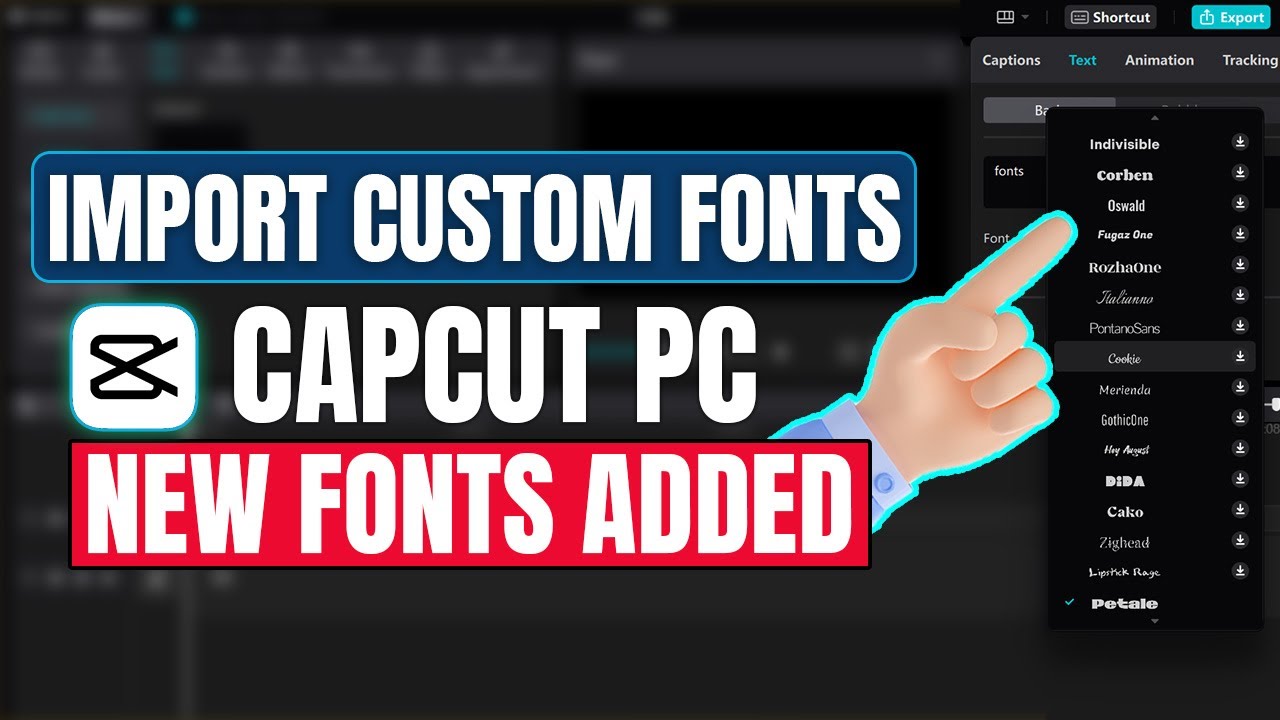
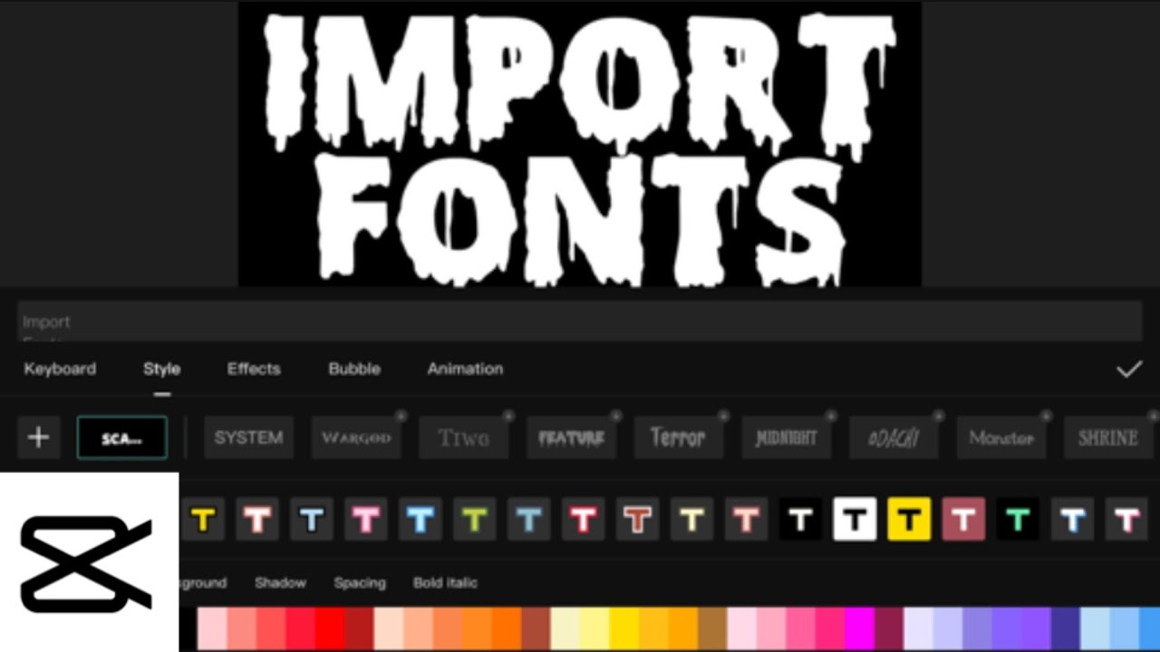
While CapCut provides a solid foundation of built-in fonts, expanding your options with custom fonts opens up a world of creative possibilities. Many websites offer free and premium fonts that can be easily integrated into CapCut. Once installed, these custom fonts can be accessed directly within the app, providing a richer and more diverse selection for your projects.
Leveraging the right fonts in CapCut offers several key benefits. Firstly, it enhances the visual appeal of your videos, capturing attention and creating a polished, professional look. Secondly, it improves readability, ensuring that your message is easily understood by your audience. Finally, it strengthens brand identity, allowing you to use consistent typography across your videos to reinforce your brand image and create a cohesive online presence.
Advantages and Disadvantages of Using Custom Fonts in CapCut
| Advantages | Disadvantages |
|---|---|
| Wider variety and unique style options | Potential compatibility issues |
| Enhanced brand consistency | Can increase file size |
| Improved visual appeal | Requires additional installation steps |
Five best practices for using fonts in CapCut include maintaining consistency, prioritizing readability, using fonts strategically for emphasis, considering your target audience, and testing your font choices on different devices.
Frequently Asked Questions:
1. How do I add custom fonts to CapCut? (Answer: Install font files on your device, then they'll appear in CapCut)
2. Are all fonts free to use in CapCut? (Answer: CapCut's built-in fonts are free, but some custom fonts may require purchase.)
3. How can I make text stand out in my CapCut videos? (Answer: Use bolding, shadows, outlines, and animations.)
4. What are some popular font combinations for CapCut? (Answer: Pair a sans-serif with a serif, or two contrasting sans-serifs.)
5. Can I use animated text in CapCut? (Answer: Yes, CapCut offers various text animation options.)
6. How do I choose the right font size for my videos? (Answer: Consider the video's resolution and the viewing distance.)
7. What are some good resources for finding free fonts? (Answer: Websites like Google Fonts and DaFont offer a vast selection.)
8. How do I avoid font licensing issues? (Answer: Use fonts with appropriate licenses for commercial use.)
Tips and tricks for using fonts in CapCut: Utilize font pairings to create visual interest. Experiment with different text animations to add dynamism. Employ text shadows and outlines to enhance readability. Adjust kerning and tracking for refined typography. Preview your video on multiple devices to ensure consistent display.
In conclusion, mastering the art of font selection in CapCut is crucial for creating compelling and professional videos. By understanding the nuances of different font styles, implementing best practices, and exploring custom font options, you can elevate your video editing game and captivate your audience. Choosing the perfect font can transform a simple video into a visually stunning masterpiece, communicating your message with clarity, style, and impact. Remember to prioritize readability, maintain consistency, and consider your target audience when making your font choices. Take advantage of the wealth of available resources, experiment with different combinations, and continuously refine your approach to typography. The right font choices can significantly enhance the overall viewing experience, boosting engagement and leaving a lasting impression on your viewers. So, take the time to explore the world of CapCut fonts and unlock the full potential of your video editing endeavors.
Unlocking efficiency your vacation express travel agent portal support guide
Finding your perfect casa de renta en mexico city a practical guide
Planning your event in posadas centro de convenciones insights


