Unleash Your Inner Scribe: Mastering Handwriting Fonts in Word
In a world dominated by sleek, sans-serif typefaces, there's a certain rebellious charm in embracing the imperfections and personality of handwriting fonts. They inject a dose of humanity, a touch of the analog, into our digital lives. But navigating the vast landscape of script fonts in Microsoft Word can feel overwhelming. Where do you begin? How do you choose the right font? And how do you avoid the common pitfalls that can make your document look amateurish instead of artisan?
This is your guide to unlocking the power of handwriting fonts in Word. We’ll delve into everything from the history and nuances of these fonts to practical tips and tricks for using them effectively. Whether you're crafting a wedding invitation, designing a logo, or simply adding a personal touch to a letter, understanding the intricacies of script fonts can elevate your work from ordinary to extraordinary.
The use of digital handwriting fonts echoes the long history of handwritten communication. From ancient calligraphy to the elegant cursive scripts of the 18th century, handwriting has always held a special significance. It's a visual representation of our voice, imbued with personality and emotion. Digital handwriting fonts allow us to capture this essence in our digital documents, bridging the gap between the traditional and the modern.
One of the primary reasons people gravitate towards these fonts is their ability to inject personality into a document. A carefully chosen script font can transform a plain text document into something that feels personal, warm, and inviting. Think of a handwritten birthday card versus a typed email—the difference in emotional impact is significant. This personalized feel is crucial in various contexts, from crafting heartfelt invitations to creating engaging social media graphics.
However, using handwriting fonts effectively is not without its challenges. Choosing the wrong font can make your document look cluttered or unprofessional. Issues with kerning (the spacing between letters) and readability can also arise, particularly with highly stylized scripts. We’ll explore these challenges and offer solutions to help you navigate the sometimes tricky terrain of script typography.
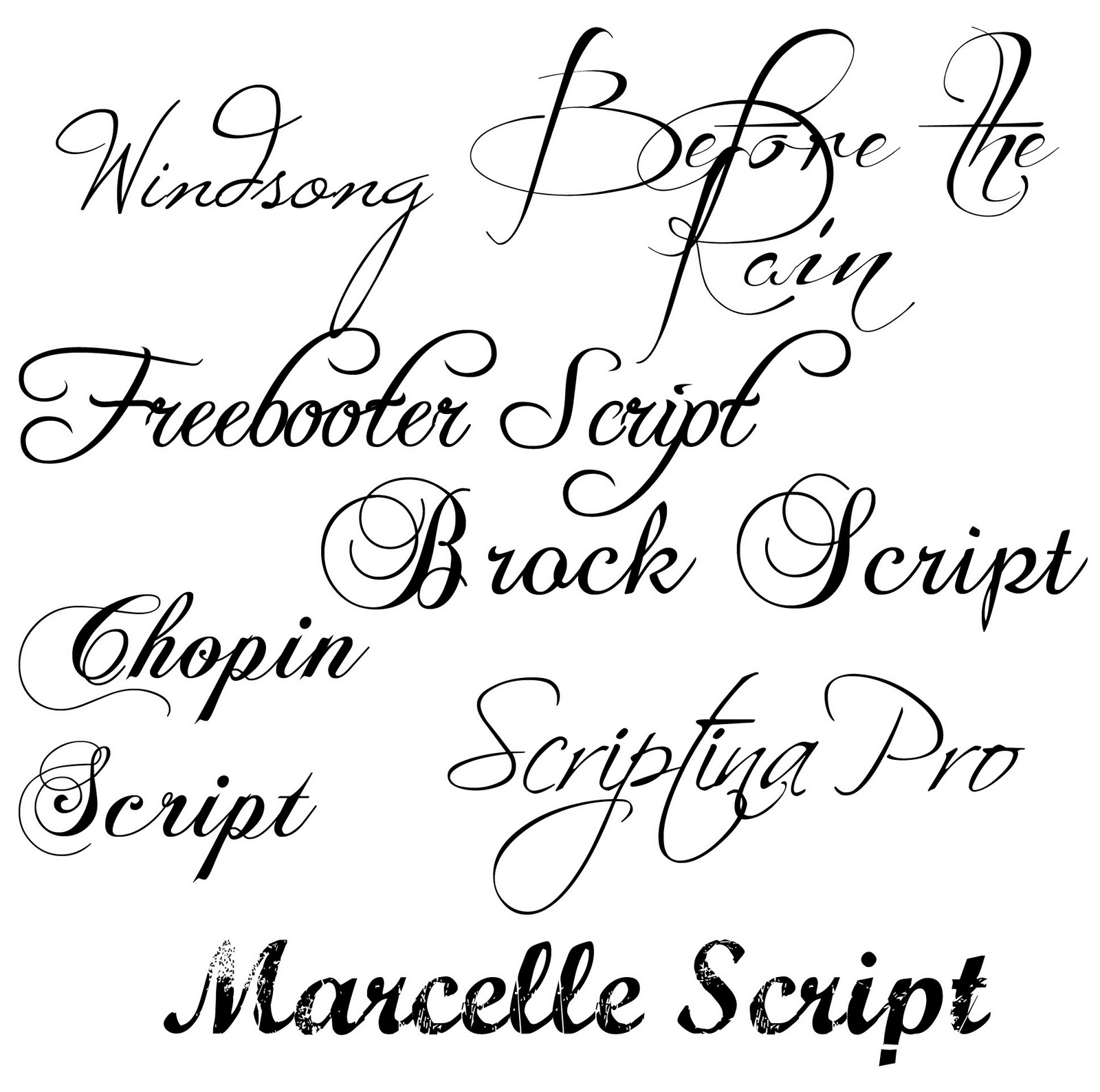
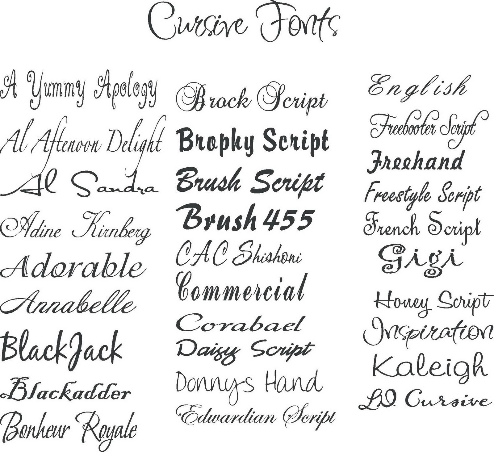
The origin of digital handwriting fonts can be traced back to the digitization of traditional calligraphy and handwriting styles. Early attempts often lacked the nuance and fluidity of true handwriting, but technology has evolved significantly. Today, we have access to a vast library of fonts that mimic various handwriting styles, from elegant copperplate scripts to casual, brush-lettered looks.
Benefits of using handwritten style fonts include increased visual appeal, added personal touch, and enhanced brand identity (especially for businesses aiming for a handcrafted aesthetic). For example, a wedding invitation using a flowing script font immediately sets a romantic and elegant tone. A business logo using a bold, hand-lettered font can convey a sense of craftsmanship and authenticity.
To effectively utilize handwriting fonts, consider the document’s purpose and target audience. Pair a formal script with elegant invitations and a casual, handwritten font with playful social media graphics. Adjust the font size and spacing for optimal readability.
Advantages and Disadvantages of Handwriting Fonts
| Advantages | Disadvantages |
|---|---|
| Adds a personal touch | Can be difficult to read in large blocks of text |
| Enhances visual appeal | May not be suitable for formal documents |
| Creates a unique brand identity | Some fonts can appear overly stylized or childish |
Best practices for using handwriting fonts include: keeping it concise, using them sparingly, choosing fonts appropriate for the context, ensuring readability, and testing different fonts before finalizing your design.
Real-world examples include using handwriting fonts for wedding invitations, restaurant menus, logos for artisan businesses, social media graphics, and personalized email signatures.
Challenges include readability issues, difficulty finding the right font, compatibility issues across different devices, and potential for overuse. Solutions involve careful font selection, testing readability on various devices, using fonts sparingly, and prioritizing clarity over style.
FAQs: What are the best handwriting fonts for formal documents? What are some free handwriting fonts? How do I install new handwriting fonts in Word? How do I adjust the kerning of a handwriting font? How can I make a handwriting font more readable? What are the common mistakes to avoid when using handwriting fonts? How can I create my own handwriting font? Where can I find high-quality handwriting fonts?
Tips and tricks: Experiment with different font sizes and spacing. Use handwriting fonts strategically for headings, titles, and short blocks of text. Pair handwriting fonts with simpler fonts for a balanced look. Test your design on different devices to ensure readability.
In conclusion, handwriting fonts offer a powerful way to inject personality and warmth into your digital documents. They bridge the gap between the traditional and the modern, allowing us to express ourselves with a unique visual voice. While using these fonts effectively requires careful consideration and attention to detail, the rewards are well worth the effort. By understanding the history, nuances, and best practices of using handwriting fonts, you can elevate your designs and create truly memorable documents. So, go ahead, unleash your inner scribe and explore the endless possibilities of handwriting typography. Embrace the imperfections, celebrate the personality, and transform your words into works of art.
Unlock your inner pro a guide to innova disc golf sets
Behr one coat interior paint a deep dive
Conquer nfl week 6 your guide to against the spread predictions


