The Enduring Appeal of Preppy: Why It Never Goes Out of Style
Okay, let's talk about "preppy." It's like that friend who always shows up put-together, even in jeans and a t-shirt. It's a look, a vibe, a whole aesthetic that just won't quit. But why? Why are we still so drawn to the crispness of a perfectly placed collar or the breezy confidence of a Nantucket backdrop?
Well, part of it is the sheer staying power. Preppy, with its roots in those hallowed halls of East Coast academia, has been around for decades. It's seeped into our collective consciousness through movies, fashion magazines, and even the occasional presidential wardrobe. It's familiar, it's aspirational, and it's got this undeniable charm that's hard to resist.
Let's break it down. When we talk about "preppy photos," think sailboats bobbing in the harbor at sunset, perfectly manicured lawns for impromptu croquet matches, and those effortlessly chic outfits that just scream "summer in the Hamptons." The colors are usually bright but not blinding – think pastels, navy, and the occasional pop of something bolder like coral or emerald green. And the overall feel? Polished, classic, and with an undercurrent of "I summered in Hyannis Port, but I wouldn't brag about it."
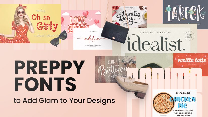
Now, about those "preppy fonts." We're talking about those serif fonts that graced your high school diplomas. Elegant, timeless, and with just a hint of formality. They bring a sense of tradition and sophistication to everything from invitations to logos. Think about it – when you see a crisp, clean font paired with a simple sailboat logo, doesn't it just scream "high-quality" and "trustworthy"? That's the power of preppy.
But here's the thing about preppy – it's not just about replicating a look. It's about capturing a feeling. It's about that effortless elegance, that sense of timeless style, and that underlying confidence that comes from knowing who you are and what you represent. And that, my friends, never goes out of style. So, whether you're drawn to the crisp lines of a classic serif font or the sun-drenched nostalgia of a perfectly preppy photo, there's no denying the enduring appeal of this iconic aesthetic. It's a reminder that sometimes, the classics really are the best.
What makes preppy imagery and typography so effective? For one, it taps into our desire for a simpler, more idyllic time. Those images of sprawling lawns and those elegant fonts evoke a sense of nostalgia, of carefree summers and a more refined era.
Second, preppy is inherently aspirational. It represents a certain lifestyle, one associated with success, education, and good taste. By incorporating preppy elements into your brand or personal style, you're subtly aligning yourself with those positive connotations.
Finally, preppy is incredibly versatile. You can go full-on nautical stripes and boat shoes, or simply add a touch of preppy polish with a classic font on your website. It's all about finding the right balance for your own personal brand.
Advantages and Disadvantages of Embracing Preppy Aesthetics
| Advantages | Disadvantages |
|---|---|
|
|
So, there you have it – the enduring appeal of preppy, broken down and decoded. It's more than just a look; it's a feeling, an aspiration, and a reminder that sometimes, the classics really are the best.
Conquering any terrain the allure of the rav4 hybrid limited awd
A knights journey on steam exploring the impact of fatestay nights release
Navigating the chic terrain of bmw dealerships in central scotland


