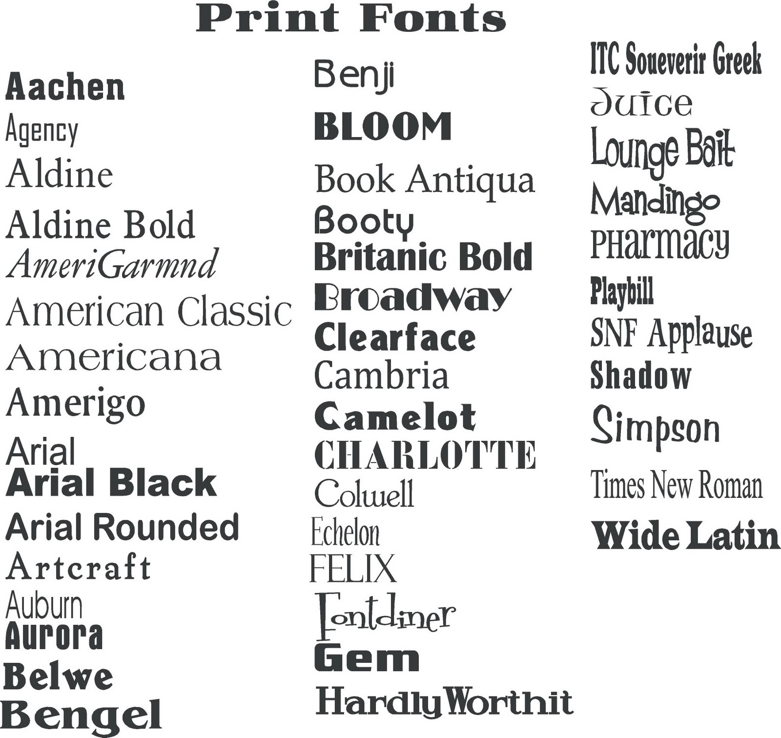
Perfecting Your Personal Brand: Choosing the Right Font for Your Name
Your name. It's more than just a label; it's your personal brand. How it's presented, especially in written form, can make a powerful impression. Choosing the right font for your name is akin to choosing the right outfit for a job interview. It's about presenting yourself in a way that aligns with your goals and makes a positive impact. Think about it – a sloppy, illegible scrawl versus a crisp, clear signature – which inspires more confidence?
So, how do you navigate the vast world of typography and pick the perfect typeface to represent *you*? This isn't about frivolous aesthetics, it's about strategic communication. The right font can convey professionalism, creativity, elegance, or even playfulness. The wrong font can make you look outdated, unprofessional, or even untrustworthy. This guide dives deep into the art and science of selecting a font suitable for a name, giving you the tools to make a smart, impactful choice.
Historically, the art of calligraphy and lettering has held immense significance. From ancient scribes painstakingly crafting illuminated manuscripts to the elegant penmanship of centuries past, the style of lettering was intrinsically linked to identity and status. Today, while we might not be dipping quills in ink, the principle remains the same. The digital age offers an explosion of font choices, allowing for unprecedented personalization. This abundance, however, can be overwhelming. How do you sift through thousands of options and find the perfect match for your name?
Choosing a font for your name isn't just about aesthetics; it's about readability and impact. A highly stylized or overly ornate font might look visually appealing, but if it's difficult to decipher, it defeats the purpose. Consider the context. Is this font for your resume, your website, or your artist signature? Each scenario calls for a different approach. A clean, professional font is crucial for a resume, while a more creative font might be appropriate for a personal website or artistic portfolio.
Understanding the basics of font psychology is key to making the right choice. Serif fonts, with their small decorative strokes, often convey tradition, formality, and reliability. Sans-serif fonts, lacking these strokes, project a more modern, clean, and minimalist feel. Script fonts mimic handwriting and can add a touch of elegance or whimsy. Experimenting with different font families can help you discover what resonates best with your personal brand.
Three key benefits of choosing the right font for your name include enhanced readability, improved professional image, and stronger brand identity. For example, using a clear, legible font like Helvetica on a resume ensures your name and contact information are easily accessible to recruiters. Employing a unique, stylish script font for a personal logo can help establish a memorable brand identity. Finally, selecting a classic serif font like Times New Roman for a formal letter adds a touch of traditional professionalism.
Advantages and Disadvantages of Different Font Types for Names
| Font Type | Advantages | Disadvantages |
|---|---|---|
| Serif | Traditional, Formal, Readable in print | Can appear dated in some contexts |
| Sans-serif | Modern, Clean, Readable on screens | Can lack personality |
| Script | Elegant, Creative, Unique | Can be difficult to read if overly ornate |
Best Practices:
1. Consider the context: Resume, website, signature, etc.
2. Prioritize readability: Avoid overly decorative or illegible fonts.
3. Test different fonts: Experiment and see what resonates with your personal brand.
4. Keep it consistent: Use the same font for your name across different platforms.
5. Seek feedback: Ask others for their opinion on your chosen font.
FAQ:
1. What font is best for a resume? A clean, professional font like Helvetica, Arial, or Calibri.
2. Can I use a script font for my name? Yes, but consider the context and ensure it's legible.
3. Are serif fonts outdated? Not necessarily, they can convey tradition and formality.
4. What font size should I use for my name? Depends on the context, but generally 12-14 points for body text.
5. Where can I find free fonts? Websites like Google Fonts and Font Squirrel offer a wide selection.
6. Should my name font match the rest of the text? It can, but it's not always necessary. Contrast can be effective.
7. How do I install a new font? Download the font file and follow the installation instructions for your operating system.
8. What font is best for a signature? A slightly stylized script or handwritten font can add a personal touch.
Tips and Tricks: Use a font preview tool to see how your name looks in different typefaces. Consider using a slightly bolder weight for your name to make it stand out.
In conclusion, selecting the right font for your name is a crucial aspect of personal branding. It's not just about aesthetics; it's about conveying your personality, professionalism, and creating a memorable impression. By understanding the nuances of font psychology, readability, and context, you can choose a typeface that truly represents you. Take the time to experiment, seek feedback, and refine your choice. Remember, your name is your brand. Present it with intention and style. Invest a bit of time upfront to explore different options and consider how they reflect your personality and aspirations. A well-chosen font can subtly but effectively enhance your personal brand, contributing to your overall success in both personal and professional endeavors. Don't underestimate the power of typography – it speaks volumes before you even say a word.
Unleash your creativity princess peach color by number printable
Benjamin moore vine green a sophisticated hue for your home
Wells fargo credit card payoff address your guide to debt freedom


