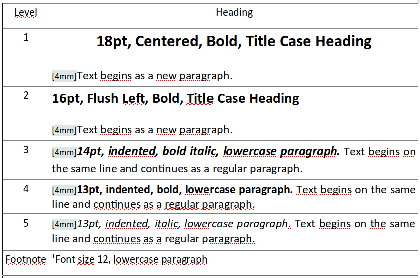
Mastering Heading Font Sizes in Research Papers: A Comprehensive Guide
Ever wondered why some research papers look so polished and professional while others feel… off? Often, it’s the subtle details that make all the difference. One such detail, surprisingly impactful, is the font size of your headings. Choosing the right heading sizes can significantly enhance readability, guide your reader through complex information, and create a strong first impression.
Think of headings like the signposts on a highway. They direct your reader, telling them where they are and where they’re going. A consistent and well-structured heading hierarchy, utilizing appropriate font sizes, is crucial for navigating the often dense information presented in academic writing. It's not just about aesthetics; it’s about effective communication.
Getting your heading font sizes right is a fundamental aspect of academic writing. Whether you’re following APA, MLA, or Chicago style, each has its own recommendations for heading levels and corresponding font sizes. However, beyond just adhering to style guides, understanding the underlying principles of visual hierarchy is key to creating a document that is both easy to read and visually appealing.
Ignoring heading font size best practices can lead to a confusing and disorganized paper. Imagine a map with inconsistent labeling – some landmarks are highlighted in bold, large font, while others are almost invisible. Similarly, inconsistent heading sizes in a research paper can disrupt the flow of information and make it challenging for the reader to grasp the overall structure and key arguments.
This comprehensive guide will delve into the intricacies of heading font sizes in research papers. We'll explore style guide recommendations, practical tips, common pitfalls, and best practices to help you master this critical element of academic writing. By the end, you’ll have the knowledge and tools to create a visually appealing and easy-to-navigate research paper that leaves a lasting impression.
Historically, the standardization of heading sizes emerged with the development of formal style guides for academic writing. These guides aimed to create consistency and clarity in scholarly publications. While early typewriters offered limited font size options, the advent of word processing software brought greater flexibility and control over formatting.
Proper heading sizes are important for several reasons. They establish a clear visual hierarchy, signaling the relative importance of different sections. This allows readers to quickly scan the document and understand its organization. Consistent heading sizes also contribute to a professional and polished look, enhancing the credibility of the research.
A common issue with heading sizes is inconsistency. Mixing different fonts, sizes, or formatting styles within the same heading level can create confusion and detract from the overall presentation. Another problem is choosing heading sizes that are too large or too small, disrupting the visual balance of the document.
For instance, in APA style, Level 1 headings are typically centered, bold, and use title case, with a font size the same as the body text or slightly larger. Level 2 headings are left-aligned, bold, and use title case. This hierarchical structure, reflected in font size and formatting, guides the reader through the paper.
Benefits of consistent and properly sized headings include improved readability, enhanced comprehension, and a more professional appearance.
A simple action plan for implementing consistent heading sizes involves consulting your chosen style guide, using the built-in heading styles in your word processor, and reviewing your document for consistency before submission.
Advantages and Disadvantages of Proper Heading Font Sizes
| Advantages | Disadvantages |
|---|---|
| Improved Readability | Time Investment in Formatting |
| Enhanced Comprehension | Potential Conflicts with Specific Journal Guidelines |
| Professional Appearance | None (when done correctly) |
Best Practices:
1. Consult your style guide.
2. Use built-in heading styles.
3. Maintain consistency.
4. Test different sizes.
5. Get feedback.
Real examples can be found in published research papers across various disciplines.
Challenges may include adhering to specific journal guidelines, but solutions involve careful review and adjustment.
FAQ:
1. What font size should my main heading be? (Answer depends on style guide)
2. How many heading levels should I use? (Generally, 3-4 are sufficient)
3. Can I use different fonts for headings? (Generally, not recommended)
4. Should headings be underlined? (Not in most style guides)
5. How do I create headings in Microsoft Word? (Use the Styles pane)
6. How do I create headings in Google Docs? (Use the Styles menu)
7. What is the difference between APA and MLA heading styles? (Different formatting rules)
8. Where can I find more information on heading styles? (Consult style manuals and online resources)
Tips and Tricks: Using the navigation pane in your word processor can help you visualize the heading structure of your document.
In conclusion, the font size of your headings plays a vital role in the readability and overall impact of your research paper. While seemingly a small detail, consistent and well-structured headings can greatly enhance the reader's experience. They contribute to a professional and polished presentation, allowing your research to shine. By understanding the principles of visual hierarchy and following the guidelines outlined in this guide, you can create a document that is not only visually appealing but also effectively communicates your research findings. Take the time to refine your heading structure and font sizes – it’s an investment that will pay dividends in the clarity and impact of your work. Start implementing these tips today, and watch your research papers transform from good to great.
Unlocking value top nfl draft prospects in round 2
Decoding the rainbow your guide to electrical wiring colors
Heartfelt wishes exploring feliz cumpleanos dios te bendiga imagenes


