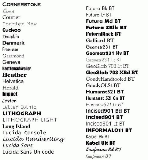
Font Family Frenzy: A Deep Dive into Typographic Territories
Ever gaze at a website and feel inexplicably drawn in, or conversely, repelled by an unseen force? Chances are, the culprit is lurking beneath the surface, whispering through the very letters you read: the font family. These collections of typefaces, each with their own unique personality, wield immense power over how we perceive information and interact with the digital world.
The universe of font families is a vast and ever-expanding one. From the crisp, efficient serifs of Times New Roman to the playful curves of Comic Sans (yes, even Comic Sans has its place!), each typeface contributes to a unique visual language. Understanding the nuances of different font families is crucial for anyone creating content, whether you're designing a website, crafting a presentation, or simply writing an email.
The history of font families is intertwined with the evolution of written communication itself. From the earliest carved letters to the digital typefaces we use today, the development of fonts reflects the changing needs and aesthetic sensibilities of different eras. The advent of printing presses in the 15th century sparked a revolution in typeface design, leading to the creation of iconic fonts like Garamond and Caslon. The digital age further expanded the possibilities, with thousands of fonts now readily available at our fingertips.
The importance of choosing the right font family cannot be overstated. A poorly chosen font can make your content appear unprofessional, difficult to read, or even convey the wrong message entirely. Conversely, the right font can enhance readability, establish a strong brand identity, and create a lasting impression on your audience. This applies to all forms of written communication, from websites and marketing materials to academic papers and personal correspondence.
Navigating the labyrinth of available font families can feel overwhelming. There are thousands of options, each with its own subtle variations and characteristics. How do you know which font is best for your project? One key aspect is understanding the different classifications of fonts, such as serif, sans-serif, script, and decorative. Each category evokes a different mood and serves a different purpose. Serifs, for example, are often associated with tradition and formality, while sans-serifs are seen as modern and clean.
One common issue with font families is ensuring consistent rendering across different devices and browsers. Web designers often use font stacks – a list of preferred fonts – to ensure that if the primary font isn't available, the browser will fall back on a suitable alternative.
Benefits of understanding font families include improved readability, enhanced brand identity, and better control over the visual presentation of your content. For instance, using a highly legible font like Open Sans for body text can make your website more accessible to users with visual impairments. Selecting a distinctive font for your logo can strengthen your brand recognition. And employing different font weights and styles can create visual hierarchy and emphasis within your content.
Advantages and Disadvantages of Wide Font Family Selection
| Advantages | Disadvantages |
|---|---|
| Greater design flexibility | Increased page load times (if not managed properly) |
| Enhanced brand identity | Potential for inconsistent rendering across devices |
| Improved readability (with careful selection) | Overwhelming choice can lead to indecision |
Best Practices for Implementing Font Families:
1. Limit the number of fonts used in a single project.
2. Pair fonts that complement each other.
3. Optimize web fonts for performance.
4. Consider accessibility when choosing fonts.
5. Test your font choices on different devices and browsers.
Frequently Asked Questions:
1. What is a font family? (A group of related typefaces.)
2. How do I choose the right font? (Consider your audience and the message you want to convey.)
3. What are web fonts? (Fonts specifically designed for use on websites.)
4. How do I install fonts on my computer? (Varies depending on your operating system.)
5. What is a font stack? (A list of preferred fonts for web browsers.)
6. How can I ensure consistent font rendering? (Use font stacks and web-safe fonts.)
7. What are some common font pairing mistakes? (Using fonts that are too similar or too different.)
8. Where can I find free fonts? (Websites like Google Fonts and Font Squirrel.)
Tips and Tricks:
Use a font manager to organize your fonts. Experiment with different font combinations. Pay attention to font size and line height for optimal readability.
In conclusion, navigating the vast landscape of font families is an essential skill for anyone involved in visual communication. Understanding the history, classifications, and best practices for implementing fonts can significantly impact the effectiveness of your designs and the overall user experience. By carefully considering your audience, message, and the specific characteristics of different font families, you can harness the power of typography to create compelling and engaging content. From the elegant serifs of Garamond to the clean lines of Helvetica, each font holds the potential to transform your words into a powerful visual statement. Take the time to explore the world of font families and discover the transformative impact they can have on your work. It’s about more than just making text look pretty; it's about crafting an experience, conveying a message, and making sure your voice is heard loud and clear, in just the right typeface.
Decoding the nyt crossword mastering the art of trimming clues
Dominate your week 3 printable nfl matchups predictions
Unleash your creativity how do you play gacha life 2


