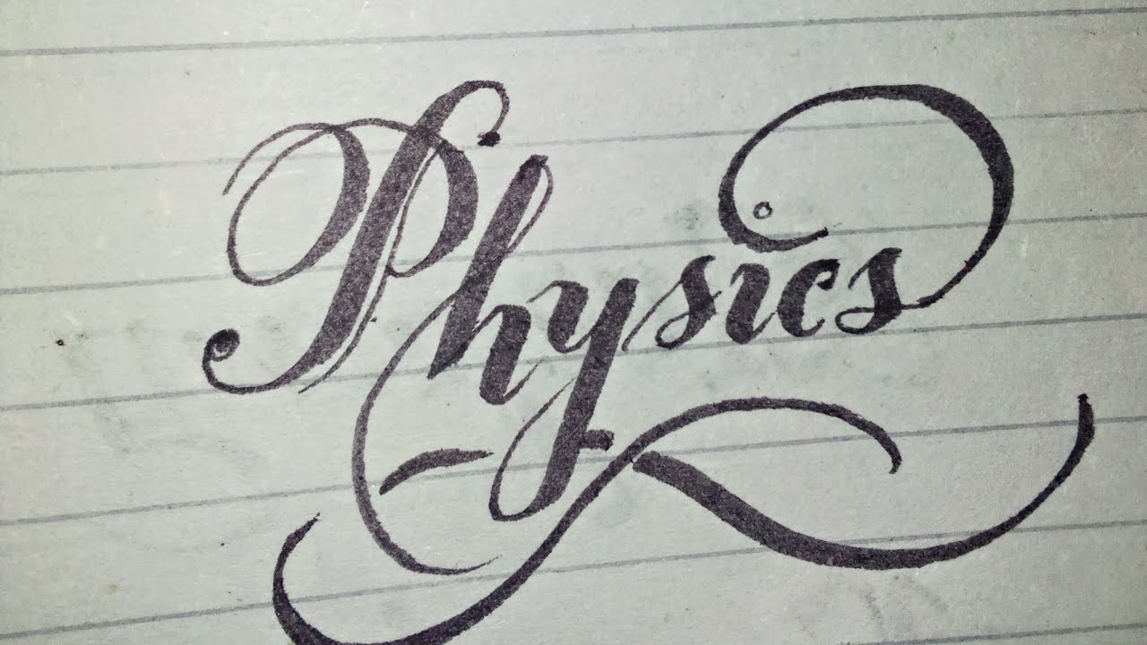
Elevate Your Design: The Power of Stylish Heading Fonts
In the digital age, where content is king, the presentation of that content is paramount. A key element of effective web design and branding is typography, and specifically, the strategic use of stylish fonts for headings. Think about it: when you land on a webpage, your eyes are immediately drawn to the headlines. They guide your reading experience and set the tone for the entire page. Choosing the right heading font can be the difference between a visitor staying engaged and bouncing off to a competitor.
The impact of a well-chosen heading font is profound. It's more than just aesthetics; it's about communicating your brand's personality and message. A sleek, modern sans-serif font might project sophistication and innovation, while a classic serif font could convey tradition and trustworthiness. The right heading font can instantly elevate your design, making it more memorable and impactful.
But the quest for the perfect heading font isn't without its challenges. With thousands of fonts available, the selection process can be overwhelming. Finding a font that is both visually appealing and legible, while also aligning with your brand identity, requires careful consideration. Moreover, ensuring cross-browser compatibility and optimizing for different screen sizes adds another layer of complexity.
Historically, heading fonts have evolved alongside printing and digital technologies. From the ornate typefaces of the Renaissance to the clean lines of modern fonts, the evolution reflects changing design trends and technological advancements. The advent of the web brought new challenges, including screen resolution and font rendering, which influenced the development and adoption of web-safe fonts.
The significance of stylish headings lies in their ability to create visual hierarchy and guide the reader's eye. Headings organize content into digestible chunks, making it easier for users to scan and comprehend information. They also contribute to the overall aesthetic appeal of a webpage, enhancing user experience and engagement.
Choosing a heading font is a strategic decision. Consider factors like your target audience, brand personality, and the overall tone of your website. Experiment with different font pairings and weights to create a visual hierarchy that is both stylish and effective.
Benefits of Stylish Heading Fonts:
1. Enhanced Readability: A well-chosen heading font can significantly improve readability, making it easier for users to quickly grasp the main points of your content. Example: Using a clear, concise sans-serif font for headings on a blog post.
2. Brand Reinforcement: The style of your headings contributes to your overall brand identity. Example: A luxury brand might use an elegant serif font to convey sophistication.
3. Improved User Experience: Stylish headings create a visually appealing and engaging experience for users, encouraging them to explore your content further. Example: Using a bold, eye-catching font for headings on a landing page.
Advantages and Disadvantages of Stylish Heading Fonts
| Advantages | Disadvantages |
|---|---|
| Enhanced Visual Appeal | Potential Readability Issues (if chosen poorly) |
| Improved Branding | Overuse Can Be Distracting |
| Better User Experience | Compatibility Issues Across Browsers/Devices |
Best Practices:
1. Limit Font Choices: Stick to a maximum of two or three fonts for your entire website.
2. Prioritize Readability: Choose fonts that are easy to read, especially at smaller sizes.
3. Create Contrast: Use contrasting font weights and sizes to create visual hierarchy.
4. Consider Font Pairing: Experiment with different font combinations to find a harmonious balance.
5. Test Across Devices: Ensure your chosen fonts render correctly on different browsers and devices.
FAQ:
1. How do I choose the right heading font? Consider your brand and target audience.
2. What are web-safe fonts? Fonts that are commonly installed across different operating systems.
3. How many fonts should I use on my website? Two or three is generally recommended.
4. Can I use custom fonts? Yes, but ensure they are properly implemented.
5. How do I optimize fonts for web performance? Minimize the number of font files and use web font optimization techniques.
6. What are some popular heading font choices? Popular choices include Helvetica, Arial, Georgia, and Playfair Display.
7. How can I preview fonts on my website? Use browser developer tools or online font previewers.
8. Where can I find free fonts? Websites like Google Fonts offer a wide selection of free fonts.
Tips and Tricks:
Experiment with different font weights and styles to create visual interest. Use online font pairing tools to find complementary fonts. Test your chosen fonts on different devices to ensure readability.
In conclusion, the strategic use of stylish heading fonts is a crucial element of effective web design and branding. From enhancing readability and reinforcing your brand identity to creating a more engaging user experience, the right heading font can significantly impact the success of your website. By carefully considering your target audience, brand personality, and following best practices, you can harness the power of typography to elevate your design and communicate your message effectively. Take the time to explore different font options, experiment with pairings, and test thoroughly to ensure optimal readability and visual appeal across all devices. Investing in the right heading font is an investment in the overall success of your online presence, creating a lasting impression on your visitors and driving engagement. Remember, your headings are often the first thing visitors see - make them count.
Pump up your ride the ultimate guide to car head units with built in amps
When is fathers day in the philippines make it count
Unlocking the magic of bluey mum pngs a comprehensive guide


