Decoding the Matrix: Font Style and Size in Research Papers
Ever stare at a wall of text and feel your eyes glaze over? In the academic arena, where dense information reigns supreme, typography can make or break your paper. Selecting the right font style and size isn’t just about aesthetics; it’s about ensuring clarity, readability, and ultimately, the successful communication of your research.
Think of your research paper as a carefully constructed argument, a meticulously built machine designed to convey complex ideas. The font you choose is the oil that keeps this machine running smoothly. A poorly chosen typeface can introduce friction, hindering comprehension and diminishing the impact of your hard work. Conversely, the right font choices can elevate your research, making it accessible and engaging for your target audience.
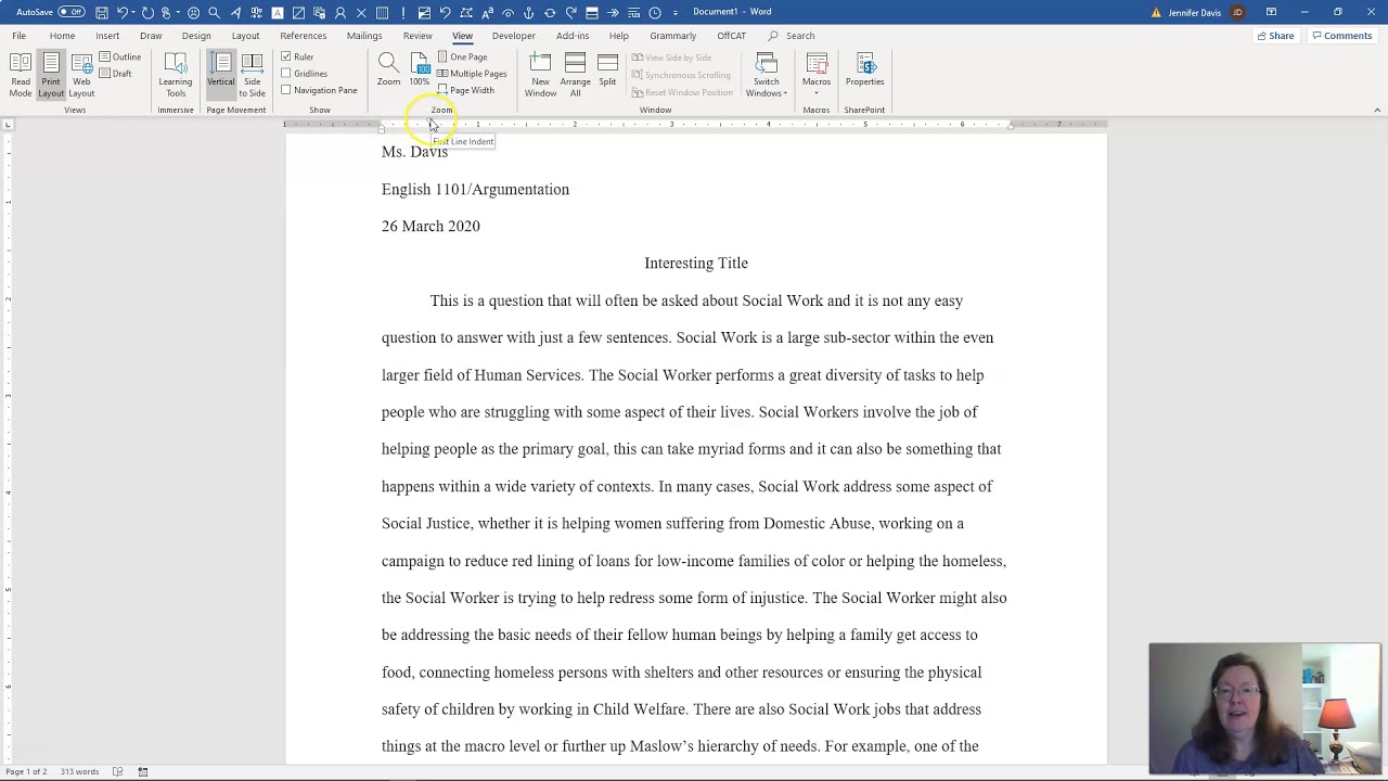
The conventions surrounding font styles and sizes in research papers have evolved over time, influenced by printing technology and academic traditions. While specific requirements may vary depending on the institution or publication, some core principles remain constant. Generally, serif fonts like Times New Roman are preferred for their perceived readability in print, while sans-serif fonts like Arial are gaining traction in digital formats.
Navigating the world of academic typography can feel overwhelming, especially for novice researchers. Questions about appropriate font sizes, acceptable styles, and the delicate balance between formality and readability often arise. This guide aims to demystify the process, providing a comprehensive overview of best practices and offering practical advice to help you make informed decisions about your research paper’s visual presentation.
Beyond the basics of Times New Roman 12pt, there's a nuanced world of typographic choices. This includes considering aspects like line spacing, kerning (the space between individual letters), and even the weight of the font (bold, regular, italic). These subtle details contribute significantly to the overall readability and professional appearance of your research paper.
Historically, serif fonts like Times New Roman dominated academic writing due to their association with traditional printing practices. The serifs, small strokes at the ends of letterforms, were believed to aid readability in long passages of text. However, with the rise of digital publishing, sans-serif fonts, known for their clean and modern appearance, have become increasingly accepted, particularly for online journals and presentations.
One crucial factor impacting font selection is accessibility. Certain fonts are easier to read for individuals with visual impairments. Choosing a clear and legible font contributes to inclusivity and ensures your research reaches a wider audience.
Benefits of appropriate font style and size include enhanced readability, improved credibility, and better adherence to academic conventions. For instance, using a standard font size like 12pt ensures your text isn’t too small or too large, while a consistent font style contributes to a professional and polished presentation. This enhances your credibility and demonstrates attention to detail.
Advantages and Disadvantages of Different Font Styles
| Font Style | Advantages | Disadvantages |
|---|---|---|
| Times New Roman | Traditional, readable in print | Can appear dated in digital formats |
| Arial | Clean, modern, good for digital | May be less readable for extensive print documents |
Best Practices:
1. Use a standard font like Times New Roman or Arial.
2. Maintain a consistent font size of 12pt throughout the body text.
3. Use italics for titles of books, journals, and other longer works.
4. Employ bolding sparingly for emphasis.
5. Ensure sufficient line spacing (usually 1.5 or double).
Examples: APA style typically recommends Times New Roman 12pt, while MLA style suggests a legible font like Times New Roman or Arial 12pt.
FAQ:
1. What is the standard font size for a research paper? Generally, 12pt.
2. Can I use different fonts for headings and body text? While possible, consistency is generally recommended.
3. Are decorative fonts acceptable? Generally not in formal research papers.
4. What about line spacing? 1.5 or double spacing is standard.
5. Should I use justified text alignment? Left alignment is typically preferred for readability.
6. What font is easiest to read for dyslexic readers? Fonts like Open Dyslexic or Arial are often recommended.
7. Can I use different font sizes for figures and tables? Yes, as long as they remain clear and legible.
8. What about fonts for online submissions? Check specific journal guidelines.
Tips and Tricks: Use a style guide (like APA or MLA) as your reference for all formatting decisions. This will ensure consistency and adherence to established academic conventions.
In conclusion, the seemingly small detail of font style and size plays a significant role in the overall impact and effectiveness of your research paper. Choosing a clear, readable font like Times New Roman or Arial in a standard size like 12pt ensures accessibility and adheres to established academic conventions. By paying attention to these details, you enhance readability, project professionalism, and allow your research to shine. Consistent formatting demonstrates meticulousness and strengthens your credibility as a researcher. Take the time to carefully consider your typographic choices and consult relevant style guides for specific guidelines. This seemingly small investment will pay significant dividends in the clarity and overall presentation of your academic work. Make sure your research is not only heard, but clearly and comfortably read.
Mastering drop caps letras capitulares en word
Conquer nfl week 6 espn straight up picks predictions
Unlock your inner artist mastering the art of balloon arrangements como hacer arreglos con globos


