Decoding the Matrix: A Deep Dive into Font Families and Their Secrets
Ever notice how a simple change in lettering can completely transform the vibe of a website, a poster, or even a simple sentence? That's the power of typography, and at its core lies the vast and fascinating world of fonts. Choosing the right typeface is more than just aesthetics; it's about communication, brand identity, and creating a user experience that resonates.
Fonts, or typefaces as they're sometimes called, are families of characters designed with consistent visual features. They are the building blocks of written communication in the digital age, influencing everything from website readability to brand perception. This exploration into the realm of font families and their names aims to demystify the world of typography, offering a practical guide to understanding and utilizing the power of different font styles.
The history of fonts is intertwined with the evolution of written language itself. From the chiseled letters of ancient Roman inscriptions to the elegant curves of calligraphic scripts, each era has left its mark on the typographic landscape. The invention of the printing press in the 15th century marked a pivotal moment, leading to the standardization and proliferation of typefaces. Today, with the rise of digital technology, the world of fonts has exploded, offering designers an unprecedented array of choices.
The importance of font selection cannot be overstated. A font isn't just a visual element; it's a powerful tool that communicates tone, personality, and meaning. A sleek, modern sans-serif font might be perfect for a tech startup, while a classic serif typeface could lend an air of authority to a legal firm. Choosing the wrong font can create dissonance, undermining your message and confusing your audience.
One of the main issues in working with fonts is ensuring readability and accessibility. While a visually striking font might look great on a poster, it could be a nightmare to read in large blocks of text. Understanding the nuances of font families, such as x-height, kerning, and leading, is crucial for creating designs that are both aesthetically pleasing and easy on the eyes. Factors like font size and color contrast also play a significant role in accessibility, especially for users with visual impairments.
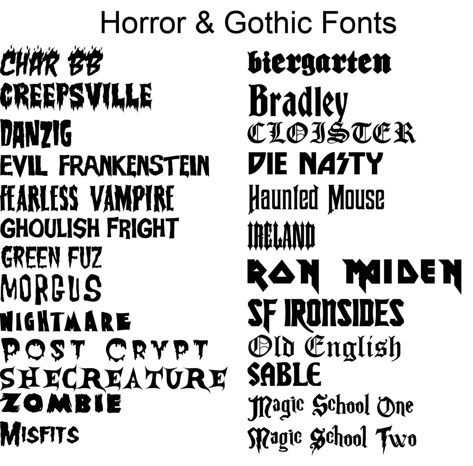
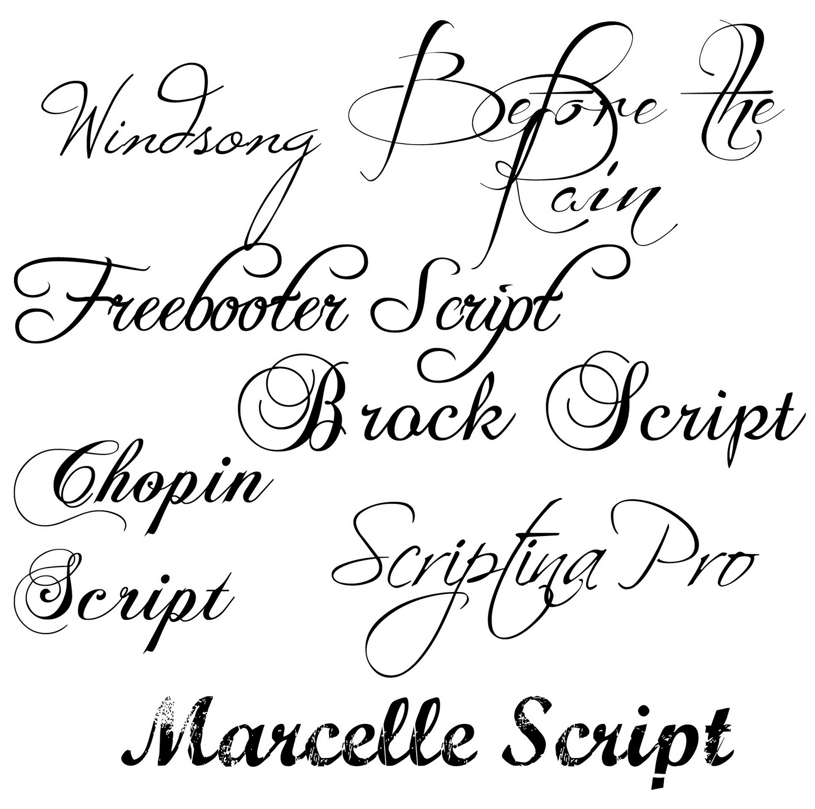
Serif fonts, like Times New Roman and Georgia, are characterized by small strokes or "feet" at the ends of letterforms. Sans-serif fonts, such as Arial and Helvetica, lack these serifs, giving them a cleaner, more modern appearance. Script fonts mimic handwriting, while display fonts are often decorative and used for headlines or short bursts of text.
Benefits of careful font selection include enhanced readability, stronger brand identity, and improved user experience. For example, using a highly legible font like Open Sans on a website can make it easier for visitors to consume content. Choosing a distinctive font for your logo can help establish brand recognition. And selecting fonts that complement each other can create a visually harmonious and engaging design.
Advantages and Disadvantages of Different Font Types
| Font Type | Advantages | Disadvantages |
|---|---|---|
| Serif | Readability in print, classic, traditional | Can appear dated online, not ideal for small sizes |
| Sans-serif | Modern, clean, good for screen readability | Can lack personality, less readable in large blocks of print |
| Script | Elegant, decorative, good for headlines | Often difficult to read in body text, best used sparingly |
Best Practices:
1. Limit the number of fonts used in a single design.
2. Pair fonts that complement each other.
3. Consider the context and purpose of your design.
4. Prioritize readability and accessibility.
5. Test your font choices on different devices and screen sizes.
Examples:
1. Medium uses a combination of serif and sans-serif fonts.
2. The New York Times utilizes a classic serif font for its body text.
3. Airbnb uses a custom sans-serif font for its branding.
4. Canva employs a variety of display fonts for its design templates.
5. Google uses its own custom sans-serif font, Product Sans.
FAQs:
1. What is the difference between a font and a typeface? (A typeface is the design, a font is the specific weight and style.)
2. Where can I find free fonts? (Google Fonts, Font Squirrel)
3. How do I choose the right font for my website? (Consider your brand personality and target audience.)
4. What is kerning? (Adjusting the space between individual letters.)
5. What is leading? (The space between lines of text.)
6. What is x-height? (The height of lowercase letters.)
7. How can I make my text more accessible? (Use sufficient contrast and avoid overly decorative fonts.)
8. What are some common font pairings? (Helvetica and Garamond, Open Sans and Lora)
In conclusion, navigating the world of different types of fonts and their names can seem daunting, but understanding the fundamental principles of typography empowers you to make informed design choices. From the timeless elegance of serif fonts to the clean modernity of sans-serif typefaces, each font family brings its own unique personality and communicative power. By considering factors like readability, accessibility, and brand identity, you can harness the power of typography to create visually compelling and effective designs. Choosing the right font is more than just an aesthetic decision; it's a strategic move that can elevate your brand, enhance user experience, and ultimately, communicate your message with clarity and impact. Take the time to explore the vast landscape of font families, experiment with different combinations, and discover the perfect typographic voice for your next project. The right font can transform your words from mere text into a powerful statement.
Unlocking the joy of nyt crossword enthusiasm
Unleash your inner artist the delicate beauty of pastel cross stitch
Liara tsoni a deep dive into the mass effects beloved asari scientist


