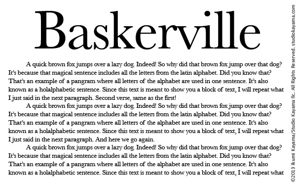
Decoding the Best Font for Your Research Paper
Choosing the right font for your research paper might seem like a small detail, but it can significantly impact how your work is perceived. A well-chosen font enhances readability, professionalism, and overall presentation. So, what's the secret to selecting the perfect typeface for your academic masterpiece?
For generations, Times New Roman has reigned supreme in the academic world. Its classic, serifed style conveys a sense of formality and tradition. However, the landscape of acceptable fonts is evolving, and other options are gaining traction. Fonts like Calibri, Arial, and Garamond are becoming increasingly popular for their clean, modern look and excellent readability.
The best font for a research paper prioritizes clarity and readability. It shouldn't distract the reader from the content. Generally, serif fonts (like Times New Roman and Garamond) are considered more readable for printed documents, while sans-serif fonts (like Calibri and Arial) are often preferred for on-screen reading.
Many academic style guides, such as APA, MLA, and Chicago, offer specific recommendations on font choices. These guidelines often specify a 12-point font size and double spacing for optimal readability. Consulting the relevant style guide for your discipline is crucial for ensuring your paper meets the required formatting standards.
Beyond simply choosing a "good" font, consider the accessibility of your choice. Opting for a clear and easily discernible font ensures your work can be accessed by a wider audience, including individuals with visual impairments.
Historically, Times New Roman became the standard due to its prevalence in print media. As digital publishing became more common, other fonts emerged as viable alternatives. The key concern with font selection is always readability. A poorly chosen font can hinder comprehension and detract from the overall quality of the research.
Serif fonts, characterized by small strokes at the ends of letterforms, are generally believed to improve readability in printed text. Sans-serif fonts, lacking these strokes, are often seen as cleaner and more modern, particularly for digital displays.
Benefits of using standard research paper fonts:
1. Enhanced Readability: These fonts are designed for clarity, making it easier for readers to engage with your work without straining their eyes. For example, Times New Roman's serifs guide the eye along the line of text.
2. Professional Appearance: Adhering to standard font conventions presents your research in a professional and credible manner, signaling academic rigor.
3. Accessibility: Commonly used fonts are generally accessible to readers with visual impairments, ensuring inclusivity.
Best Practices:
1. Consult your style guide: Always refer to the specific font requirements outlined in your chosen style guide (APA, MLA, Chicago, etc.).
2. Maintain consistency: Use the same font throughout your entire document, including headings, body text, and footnotes.
3. Avoid decorative fonts: Stick to professional, easily readable fonts.
4. Choose an appropriate size: 12-point font is the standard for most academic papers.
5. Test your font choice: Print a sample page to ensure the font is legible and visually appealing in print.
Advantages and Disadvantages of Common Research Paper Fonts
| Font | Advantages | Disadvantages |
|---|---|---|
| Times New Roman | Classic, familiar, good readability in print | Can appear dated, less readable on screen |
| Calibri | Modern, clean, good readability on screen | May lack formality for some academic contexts |
| Arial | Widely available, clean, good readability on screen | Can appear generic |
FAQ:
1. What is the most common font for research papers? Times New Roman has traditionally been the most common, but Calibri and Arial are gaining popularity.
2. Can I use a different font size? Most style guides recommend 12-point font.
3. Are decorative fonts acceptable? No, decorative fonts should be avoided in academic writing.
4. What about fonts for online submissions? Sans-serif fonts like Calibri or Arial are often preferred for online reading.
5. Should I use different fonts for headings and body text? No, maintain consistency throughout the document.
6. Where can I find free fonts? Several websites offer free fonts, but ensure they are appropriate for academic use.
7. Can I use a different font for my title page? Follow your style guide's recommendations.
8. What if my style guide doesn't specify a font? Choose a clear, readable font like Times New Roman or Calibri.
Tips and Tricks:
When in doubt, opt for a classic, readable font like Times New Roman or Calibri. Always double-check your style guide's requirements. Consider the accessibility of your font choice.
Choosing the right font for your research paper is a crucial step in ensuring your hard work is presented effectively. By adhering to standard conventions and prioritizing readability, you can enhance the professionalism and accessibility of your academic writing. Selecting a clear and appropriate font allows your research to shine, enabling readers to focus on the content and appreciate the depth of your scholarship. Remember to consult your style guide and prioritize clarity and accessibility when making your decision. Take the time to make the right font choice – it’s a small detail that can make a big difference in the overall impact of your research. This seemingly small detail contributes significantly to the overall impression your work makes, ensuring your research is presented in its best light.
Unlocking your dream home a guide to biaya bangun rumah per meter persegi
Boost your brand with strategic swag bag promotional products
Elevate your space with incesa gray 60x60 paving tiles


