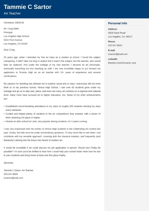
Deciphering the Perfect Font Size for Your Letters
Ever stared at a document, squinting and struggling to decipher the tiny text? Or maybe you've received a letter with such large font it felt like a children's book? Choosing the right font size for your letters is more than just aesthetics; it's about effective communication and ensuring your message gets across clearly. This guide dives deep into the world of font sizing, providing you with the knowledge to craft perfectly readable and visually appealing letters every time.
The appropriate letter font size is a crucial element of document design, influencing readability and overall impact. While there isn't a single "perfect" size, understanding the context and your audience is key. Whether you're drafting a professional email, composing a personal note, or designing a formal letter, font size significantly affects how your message is perceived.
Historically, font sizes were dictated by the physical limitations of printing presses and typewriters. With the rise of digital communication, a broader range of font sizes became readily available. Today, we have unprecedented control over typography, but this also introduces the challenge of selecting the most appropriate size for different purposes.
The importance of proper font sizing cannot be overstated. It impacts readability, accessibility, and the overall professionalism of your communication. An incorrectly chosen font size can make your message difficult to read, hindering comprehension and potentially leading to misinterpretation. Moreover, small font sizes can exclude individuals with visual impairments, highlighting the importance of accessibility considerations.
One of the main issues related to appropriate font sizing is the lack of clear guidelines for various document types. While some style guides offer recommendations, there is often a degree of subjectivity involved. Navigating these nuances is essential for ensuring your letters are both legible and visually appealing.
For printed letters, a font size between 10 and 12 points is generally considered standard. This range provides a comfortable reading experience for most individuals. For online communication, slightly larger sizes, around 12-14 points, are often preferred due to screen resolution variations. However, context matters. For example, a formal business letter might benefit from a traditional 12-point font, while a friendly email could utilize a slightly larger size.
Choosing the appropriate font size offers several benefits. Firstly, it enhances readability, ensuring your message is easily digested. Secondly, it promotes accessibility, making your content inclusive for individuals with visual impairments. Thirdly, the right font size contributes to the overall professionalism of your communication, reflecting attention to detail and respect for your audience.
Creating an effective letter involves considering various factors beyond just the font size. Think about the font style, line spacing, and margins. Using clear and concise language further enhances readability. Testing your document with different readers can provide valuable feedback on the overall clarity and impact.
Advantages and Disadvantages of Different Font Sizes
| Font Size | Advantages | Disadvantages |
|---|---|---|
| Small (8-9pt) | Fits more text on a page | Can be difficult to read, especially for those with visual impairments |
| Medium (10-12pt) | Generally considered the standard for printed materials; good balance of readability and space efficiency | May be slightly too small for online reading or individuals with mild visual impairments |
| Large (14-16pt) | Easy to read, particularly for those with visual impairments or for online content | Takes up more space, may appear less formal |
Best Practices:
1. Consider your audience and document purpose.
2. Test your document with different readers.
3. Prioritize accessibility by using larger font sizes when appropriate.
4. Maintain consistency throughout your document.
5. Use a clear and legible font style.
Real-World Examples:
1. Business letters: Typically use 12pt font.
2. Emails: Often use 12-14pt font.
3. Academic papers: Often use 12pt font.
4. Legal documents: May use smaller font sizes due to length.
5. Marketing materials: Font size varies depending on the design.
FAQ:
1. What is the standard font size for a letter? Generally, 10-12pt.
2. What font size should I use for an email? 12-14pt is often recommended.
3. What font is best for readability? Fonts like Times New Roman, Arial, and Calibri are generally considered easy to read.
4. How does font size affect accessibility? Smaller fonts can be difficult for those with visual impairments to read.
5. Should I use the same font size for all documents? No, consider the purpose and audience of each document.
6. How can I determine the best font size for my document? Test it with different readers and consider accessibility guidelines.
7. What are some tools for checking font size? Word processors and design software often have built-in tools for adjusting and checking font size.
8. Are there legal requirements for font size in certain documents? Some legal documents may have specific font size requirements, so it's important to check relevant regulations.
In conclusion, selecting the correct font size for your letters is a vital aspect of effective communication. By considering your audience, document purpose, and accessibility guidelines, you can create letters that are both visually appealing and easily readable. A well-chosen font size enhances readability, promotes inclusivity, and contributes to a professional image. Remember, the goal is to ensure your message is conveyed clearly and effectively. So, take the time to consider your font choices carefully – it will make a world of difference in how your communication is received.
Find your place in the sun property for sale in del rio texas
Navigating healthcare understanding bpjs fines and payments cara bayar denda bpjs
Unveiling the fortress what is the entrance room of a castle called


:max_bytes(150000):strip_icc()/ResignationLetter_2063073_2022-8e52542baa96457bb64d3191e73f9034.jpg)


