Deciphering the Nuances of Formal Font Sizing in Word Documents
In the meticulously crafted world of professional documents, the seemingly mundane detail of font size holds significant weight. It's the subtle sartorial choice that can either elevate your work to polished perfection or leave it languishing in amateur territory. Choosing the most formal font size in Word is not merely a matter of aesthetics; it’s a statement of professionalism, respect for the reader, and an understanding of document etiquette.
Consider the crispness of a well-tailored suit or the elegant drape of a perfectly fitted dress. Just as these details contribute to a polished overall appearance, the appropriate font size lends an air of sophistication and credibility to your written work. Too large, and it appears childish and informal; too small, and it risks becoming an exercise in frustration for the reader. The most suitable font size walks a fine line, balancing readability with an air of refined formality.
The history of formal font sizing is interwoven with the evolution of typography and printing itself. From the rigid structures of early typefaces to the digital versatility of modern fonts, the quest for optimal readability has been a constant. Historically, documents intended for official or scholarly purposes often employed slightly smaller font sizes, reflecting the value placed on concise and efficient communication. This tradition continues to influence contemporary document design, particularly in formal settings.
The importance of correct font sizing cannot be overstated. It directly impacts readability, influencing how easily and quickly a reader can process information. An appropriate size minimizes eye strain, encourages engagement, and conveys respect for the reader's time. In the professional realm, this translates to clearer communication, improved comprehension, and a more positive reception of your message.
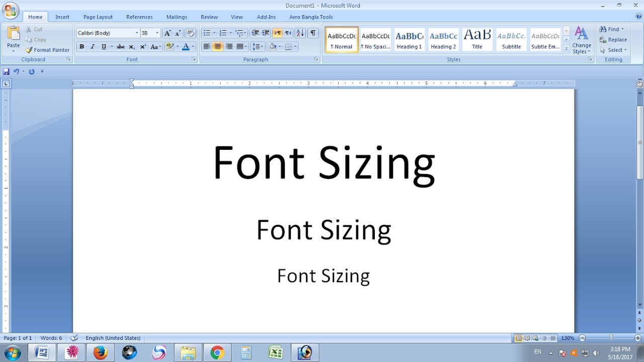
One of the primary issues associated with selecting formal font sizes is the lack of a universally prescribed standard. While 12-point is generally considered the default for body text in many contexts, formal documents may benefit from a slightly smaller size, such as 11-point, especially when using fonts like Times New Roman or Calibri. The key is to prioritize legibility and ensure the text appears polished and professional, avoiding extremes that hinder readability.
A practical example of appropriate formal font sizing is a legal document. These often utilize 11-point Times New Roman, balancing formality with the need for dense information. Conversely, a business proposal might opt for 12-point Calibri for a modern yet professional look.
Benefits of choosing an appropriate formal font size include enhanced readability, improved document aesthetics, and a stronger impression of professionalism. A well-chosen font size contributes to a visually appealing document that is easy to navigate and digest, ultimately enhancing the effectiveness of your communication.
Best practices for implementing formal font sizing include considering the document's purpose, choosing a classic typeface, and testing the readability across different devices. Consistency throughout the document is crucial, ensuring headings and subheadings maintain a harmonious relationship with the body text.
Advantages and Disadvantages of Smaller Font Sizes for Formality
| Advantages | Disadvantages |
|---|---|
| Conveys a sense of professionalism and formality | Can reduce readability, especially for those with visual impairments |
| Allows for more content on a page, potentially saving paper | May appear cramped or cluttered if not balanced with appropriate spacing |
Frequently Asked Questions:
1. What is the most common formal font size? Answer: 11-12 point.
2. What are the best fonts for formal documents? Answer: Times New Roman, Calibri, Garamond.
3. Should I use different font sizes for headings? Answer: Yes, but maintain a clear hierarchy and visual balance.
4. How can I ensure my document is readable? Answer: Test it on different devices and consider using line spacing adjustments.
5. Is it ever appropriate to use a font size smaller than 11-point for formal documents? Answer: Generally, no, unless specific formatting guidelines dictate otherwise.
6. How does font choice impact formality? Answer: Certain fonts are perceived as more formal than others. Serif fonts like Times New Roman are often viewed as more traditional and formal.
7. What is the role of kerning and tracking in formal documents? Answer: Proper kerning and tracking enhance readability and contribute to a polished, professional look.
8. Can I use decorative fonts in formal documents? Answer: Generally avoid decorative fonts in formal contexts as they can detract from the document's professionalism.
Tips and tricks: Experiment with slight adjustments to line spacing and character spacing to further enhance readability.
In conclusion, the appropriate selection of font size for formal documents is a subtle yet powerful tool for conveying professionalism and respect for the reader. By understanding the historical context, adhering to best practices, and prioritizing readability, you can elevate your written work from mundane to masterful. The seemingly small detail of font size becomes a significant element in crafting a document that is not only informative but also visually compelling and reflective of your meticulous attention to detail. Take the time to consider the nuances of font sizing and unlock the potential of your written communication. By paying close attention to these details, you demonstrate not only an understanding of document etiquette but also a commitment to clear and effective communication, ultimately enhancing the impact of your message and strengthening your professional image.
Red letter a clipart make your designs pop
Rock the waves the ultimate guide to fusion marine stereos
Spice up your discord funny things to make your status shine


