Ace Your Presentation: Choosing the Perfect PowerPoint Font
Have you ever sat through a PowerPoint presentation where the slides were visually jarring, the text hard to decipher, and the overall effect… underwhelming? The culprit might surprise you: the font. While content is king, the way it's presented visually, specifically through typography, plays a crucial role in audience engagement and information retention.
Choosing the best font for a PowerPoint presentation is a critical design decision that can significantly impact the effectiveness of your communication. It's not merely about aesthetics; it's about clarity, readability, and projecting the right tone and professionalism. The right typeface can transform your slides from amateurish to polished, from confusing to compelling.
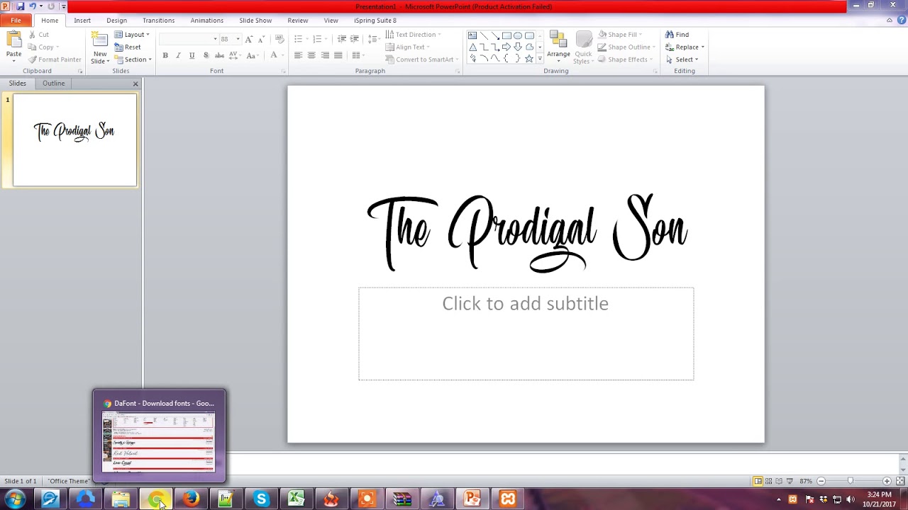
In the realm of presentations, font selection is a delicate balancing act. You need a font that is both visually appealing and easily readable from a distance. Think of it as the sartorial choices for your presentation: you wouldn't wear a ball gown to a business meeting, just as you wouldn't use a whimsical, curly font for a serious corporate presentation. This brings us to the question: what constitutes the "best" font?
The landscape of typography is vast, with seemingly endless choices. Navigating this landscape can be daunting, especially when the stakes are high, like a classroom presentation. While personal preference plays a role, certain fonts are universally recognized for their clarity and effectiveness in slide presentations. These fonts typically fall into the categories of serif and sans-serif.
Historically, serif fonts, characterized by small decorative strokes at the ends of letterforms, were favored for printed materials. However, with the rise of digital displays, sans-serif fonts, lacking these strokes, have gained prominence for their clean, modern appearance and on-screen readability. This shift has significantly influenced font choices for digital presentations, with sans-serif fonts generally being preferred for their clarity on projectors and screens.
Sans-serif fonts like Arial, Calibri, and Helvetica are popular choices for their clean lines and readability. They project a modern and professional image. For a more traditional or formal feel, serif fonts such as Garamond or Georgia can be used sparingly, primarily for headings or short blocks of text. However, it's crucial to avoid overly decorative or stylized fonts that can compromise readability.
One key benefit of choosing the right typeface is enhanced readability. Clear, legible text ensures that your audience can easily absorb the information you're presenting. A good font complements your message, not distracts from it.
Another advantage is improved visual appeal. A well-chosen font contributes to a professional and polished look, enhancing your credibility and the overall impact of your presentation.
Finally, consistent font usage creates a sense of unity and cohesion throughout your presentation, making it easier for the audience to follow along and retain information.
Advantages and Disadvantages of Different Font Types
| Font Type | Advantages | Disadvantages |
|---|---|---|
| Sans-serif (e.g., Arial, Calibri) | Clean, modern, readable on screens | Can look generic, less impactful for headings |
| Serif (e.g., Times New Roman, Georgia) | Traditional, formal, readable in print | Can appear cluttered on screens, less modern |
Best Practices:
1. Limit your font choices to two or three for consistency.
2. Use larger font sizes (at least 24pt) for body text to ensure readability from a distance.
3. Choose high-contrast color combinations for text and background (e.g., dark text on a light background).
4. Avoid using all caps, as it can be difficult to read.
5. Test your font choices on a projector or large screen to ensure optimal readability.
FAQ:
1. What is the best font size for PowerPoint presentations? At least 24pt for body text.
2. Should I use serif or sans-serif fonts? Generally, sans-serif is preferred for on-screen presentations.
3. Are decorative fonts appropriate for presentations? Generally no, they can compromise readability.
4. How many fonts should I use in one presentation? Limit yourself to two or three for consistency.
5. What are some examples of good PowerPoint fonts? Arial, Calibri, Helvetica, Garamond (for headings).
6. How can I test my font choices? Project your presentation on a large screen.
7. What if my audience has visual impairments? Consider using larger font sizes and high contrast.
8. How do fonts affect the tone of my presentation? Different fonts evoke different feelings and levels of formality.
In conclusion, selecting the perfect font for your PowerPoint presentation is an essential aspect of effective communication. It’s not simply an aesthetic choice but a strategic decision impacting readability, visual appeal, and overall message delivery. By understanding the principles of typography and adhering to best practices, you can transform your presentations from mundane to memorable, ensuring your message resonates with your audience. Take the time to experiment with different font combinations, keeping in mind the context of your presentation and the needs of your audience. A little attention to detail in this area can significantly elevate the professionalism and impact of your work. Start optimizing your PowerPoint presentations today with the right font choices, and watch your audience engagement soar.
Rescue your wood banishing those pesky white marks
The power of a pose exploring the allure of silueta de mujer posando
Crank up your ride the ultimate guide to car amplifier installation


